SV Signs delivers real estate and custom signage solutions. I redesigned their digital presence to enhance UX and engagement.
My role
UX/UI design, prototyping and user research
Optimizing website navigation & mobile experience
Collaborating with developers to ensure seamless implementation
Developing and executing a strategic social media presence
Results
67.62% increase in traffic through UX-focused redesign
Conversion rates improved from 15% to 40%
Stronger brand engagement with strategic social media expansion
Improved product discoverability, enhancing the shopping experience
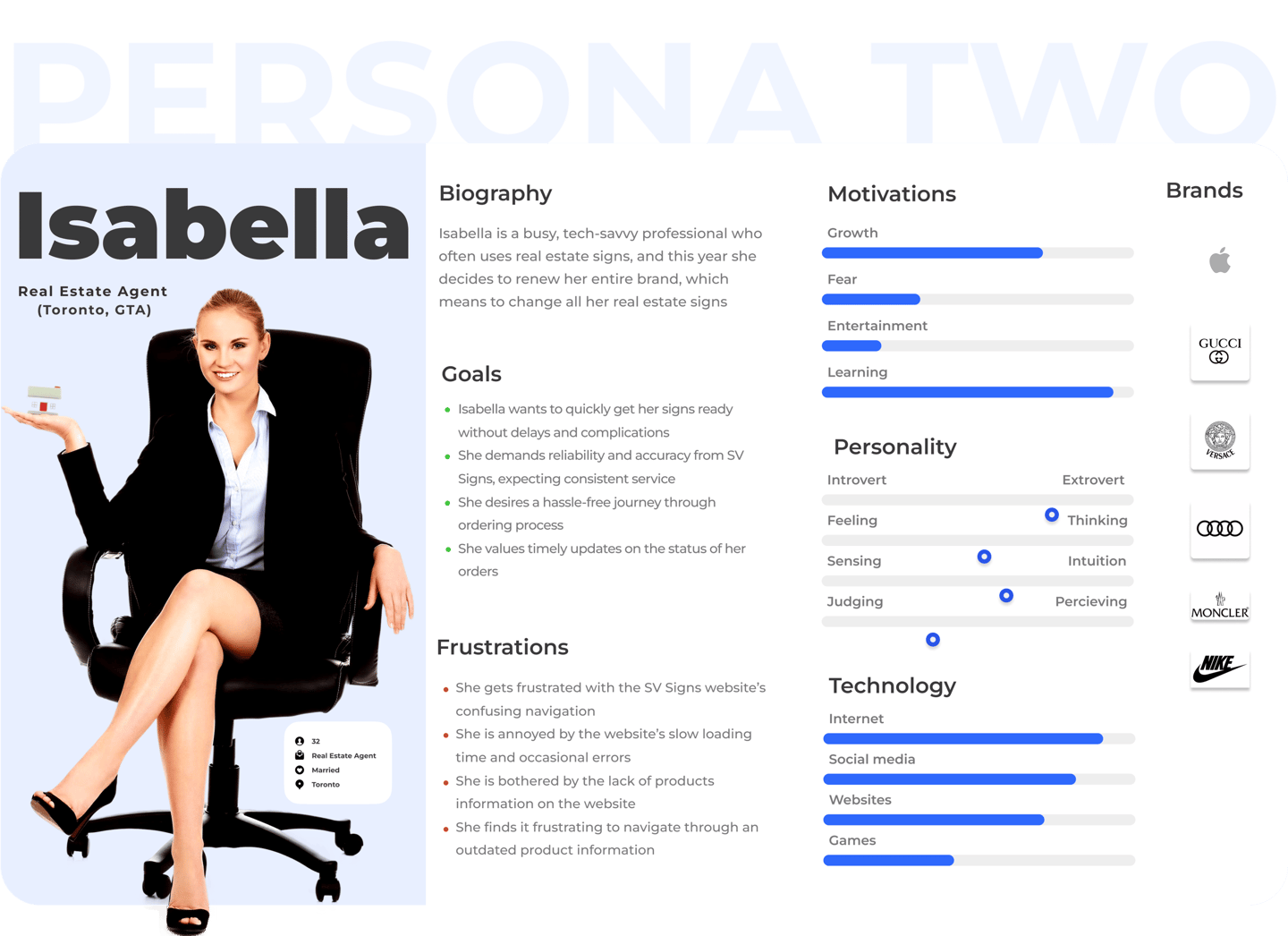
Understanding SV Signs’ Customers & UX Challenges
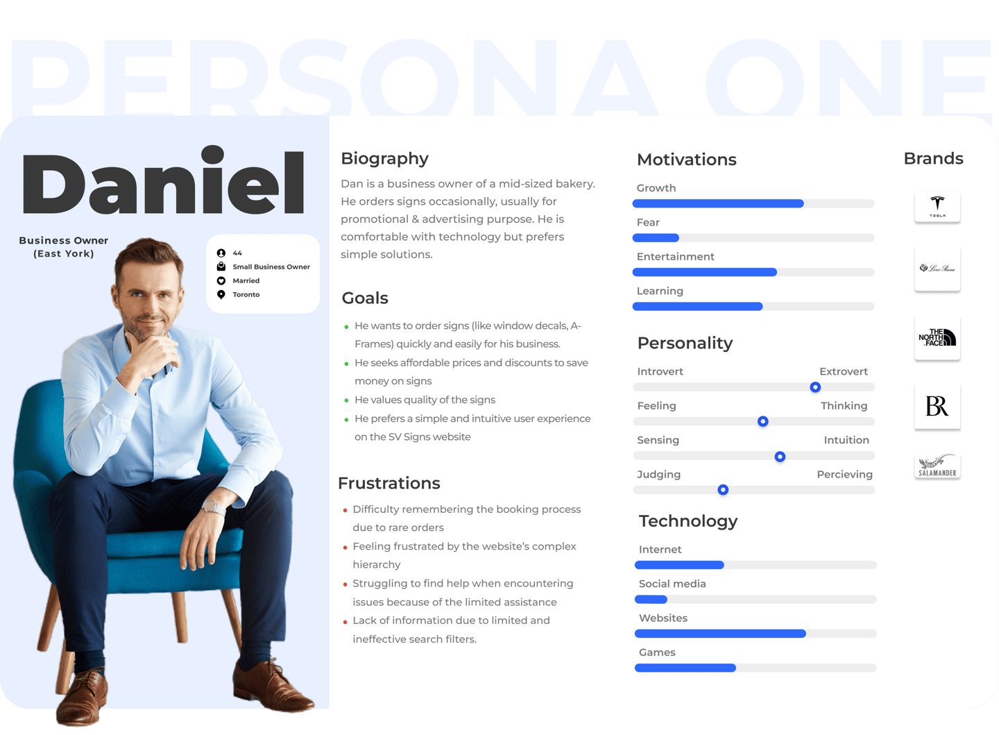
SV Signs serves real estate agencies, small business owners, retail managers, and corporate marketing teams—professionals who rely on digital tools and expect seamless online experiences. My research showed that they often dismiss signage providers if the website or app is difficult to use.
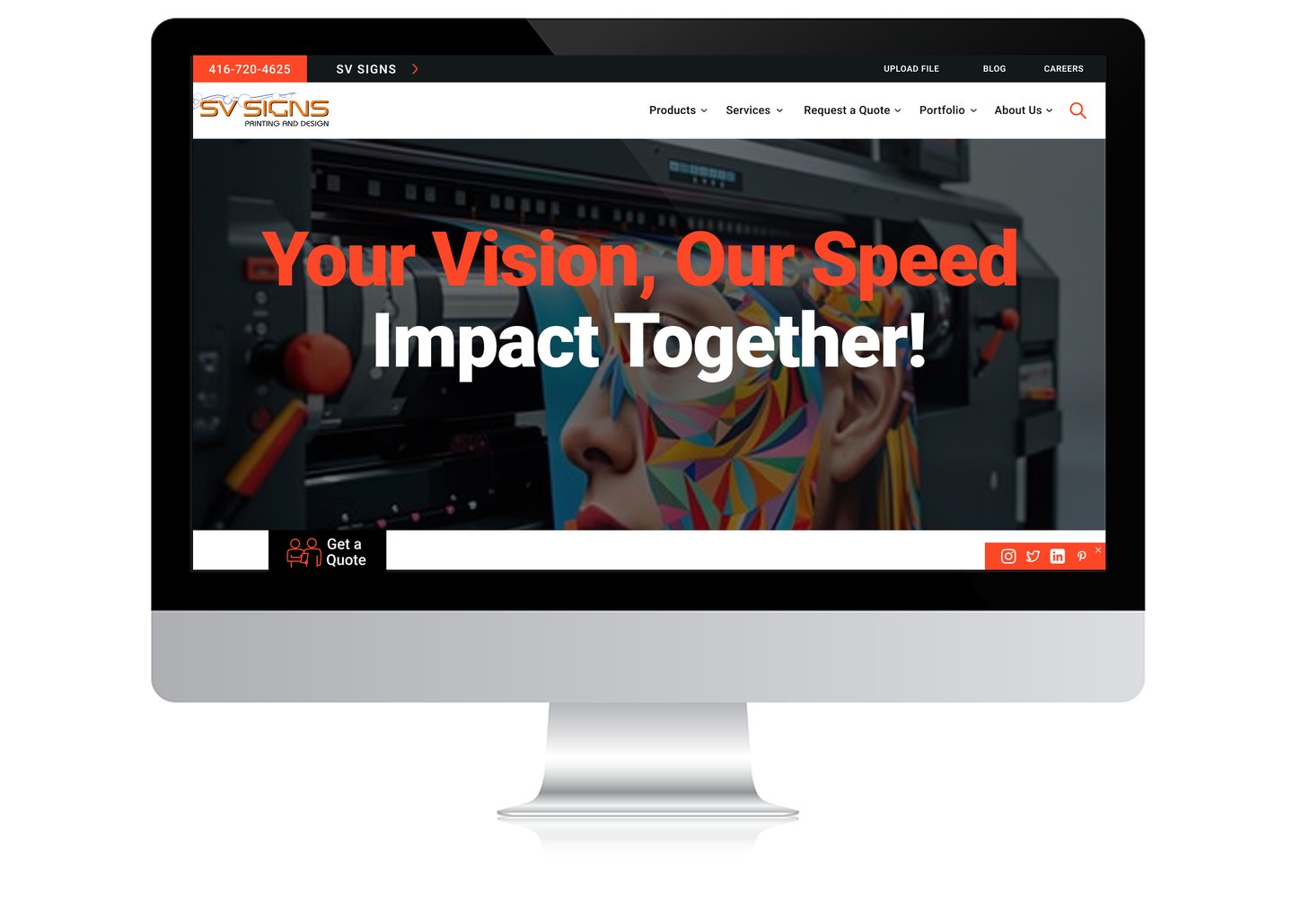
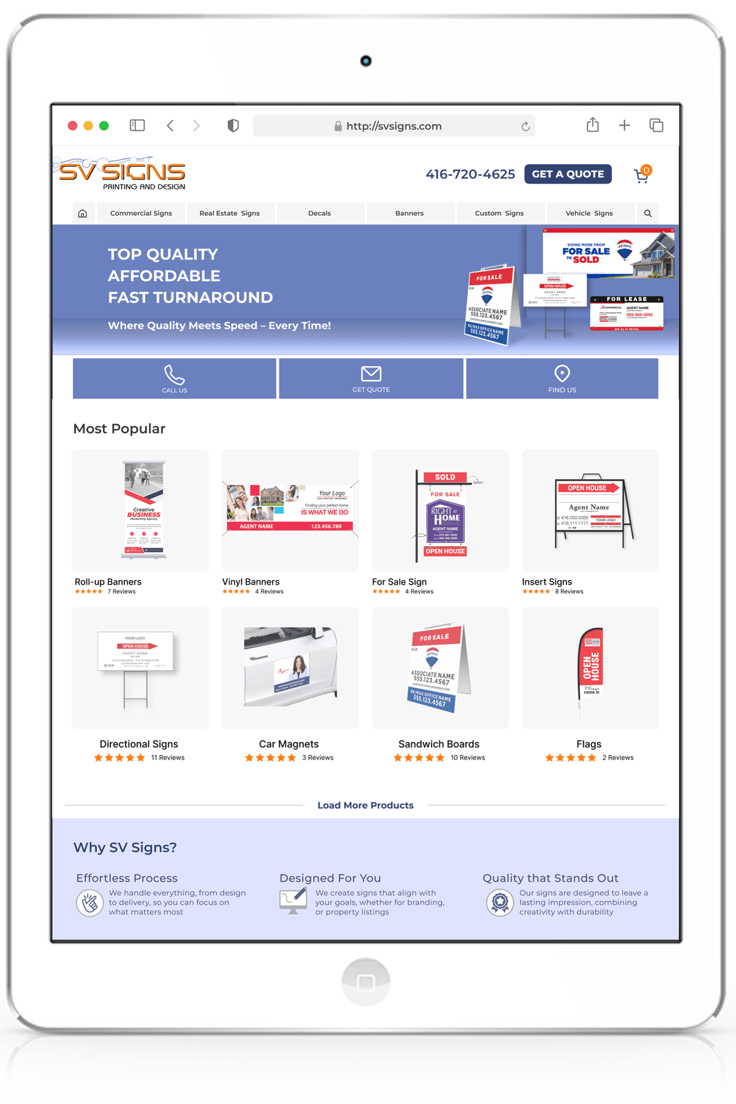
SV Signs' outdated website was a major barrier. Poor mobile responsiveness and confusing navigation led to abandoned purchases, costing revenue and frustrating users.
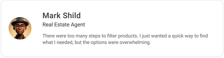
I also found that industry terms made ordering signage more complicated than it needed to be. These customers wanted a fast, clear, and visually driven ordering process. The goal was to design a user-friendly platform that made signage procurement effortless for busy professionals.


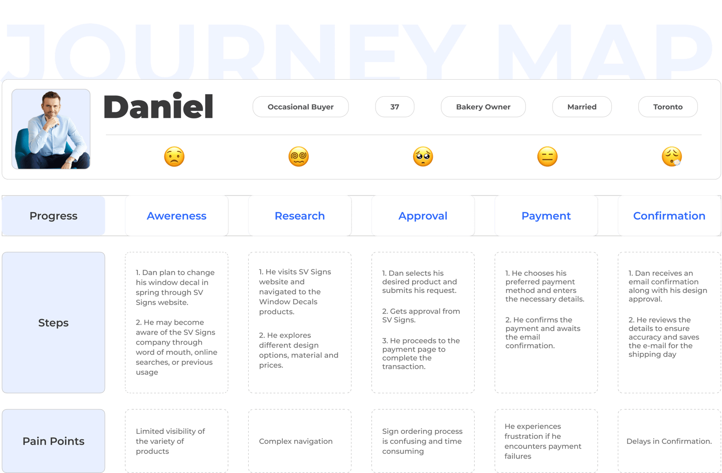
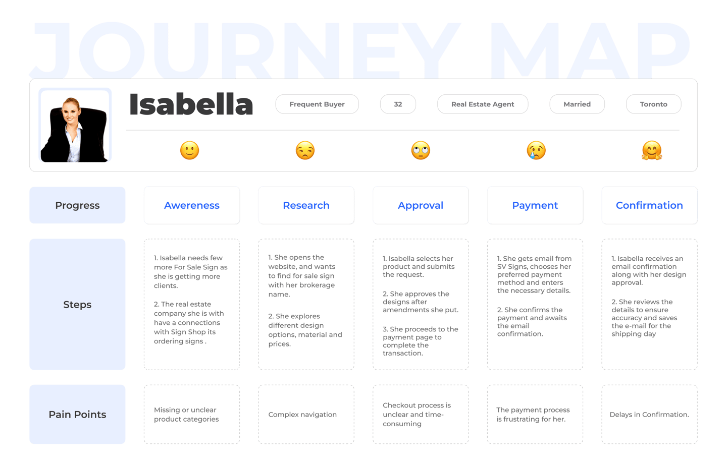
I kicked off the project with rapid user research to identify key pain points in SV Signs' existing website. Through focused interviews and usability testing, I uncovered major navigation issues, particularly for mobile users. The lack of a mobile-friendly platform created barriers for business professionals trying to order signage quickly.
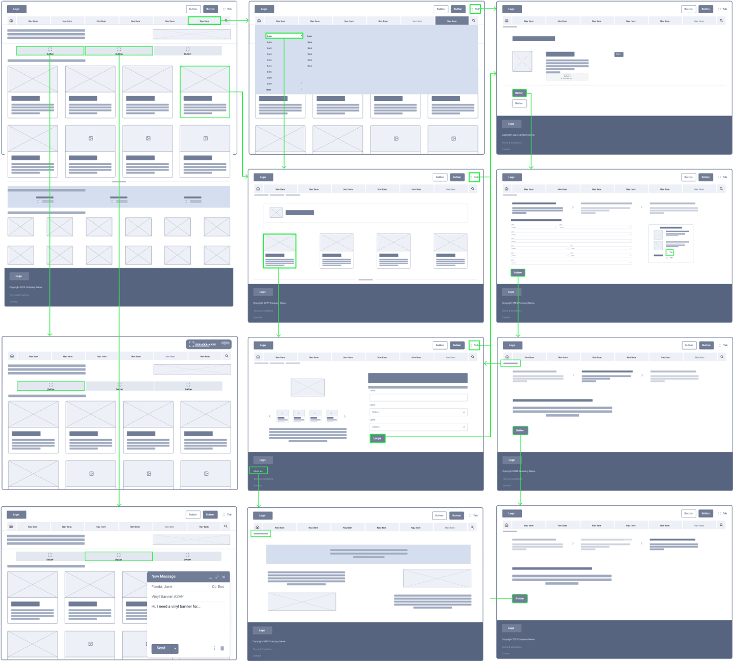
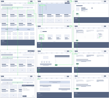
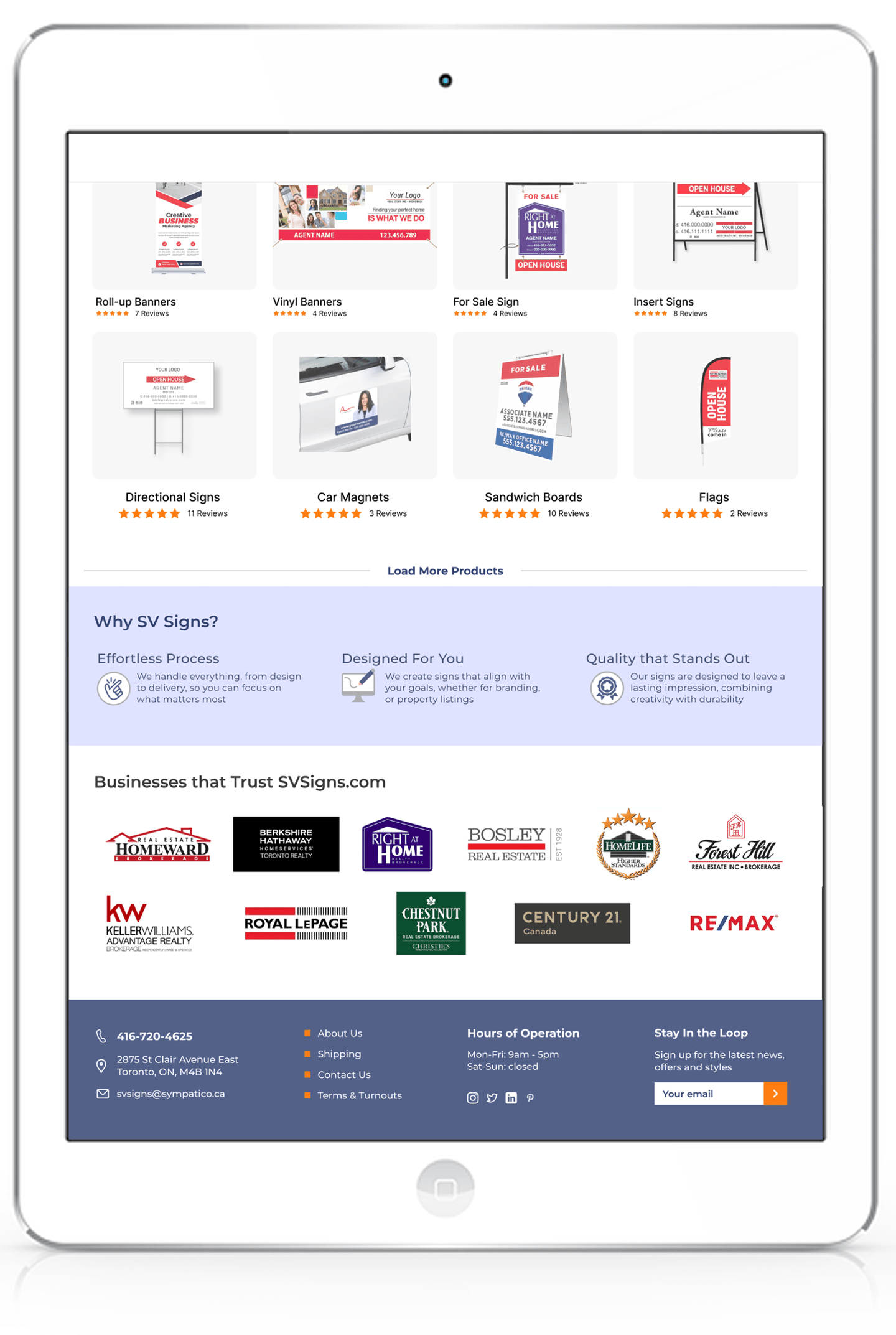
Collaborating closely with the web developer, we designed a fully responsive website, ensuring seamless navigation across all devices. To simplify product discovery, I developed a flexible, user-centric categorization system that made browsing more intuitive.
Week One:
Week Two:
Week Three:
In the final phase, we optimized the checkout process with a streamlined three-step cart system, reducing friction and improving conversions. Additionally, we refined product descriptions to better resonate with business professionals and real estate agents, making purchasing decisions faster and easier.
The Challenge: 50% Traffic and Order Growth in Just 3 Weeks
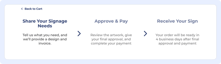
Multiple redirects and unnecessary form fields caused frustration and abandoned purchases. A simplified three-step checkout process was implemented, reducing friction and improving conversion rates.
Confusing Checkout Flow
Pain Points & Solutions

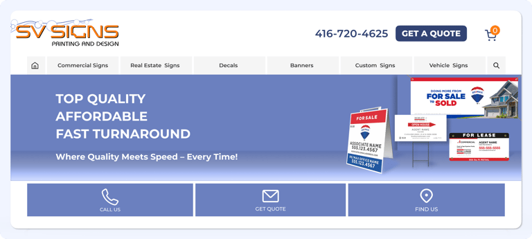

Unclear Menu Structure
Multiple Products were difficult to locate due to mislabeled or buried categories. The menu was redesigned with clear, structured categories, and new product groupings were added based on user needs, making browsing faster and more efficient.
Improved Navigation & Emphasis
Multiple Poor layout and lack of emphasis on key actions made it difficult for users to complete tasks efficiently. Navigation was optimized, and important actions like "Add to Cart" and "Request a Quote" were made more prominent, improving usability and engagement.
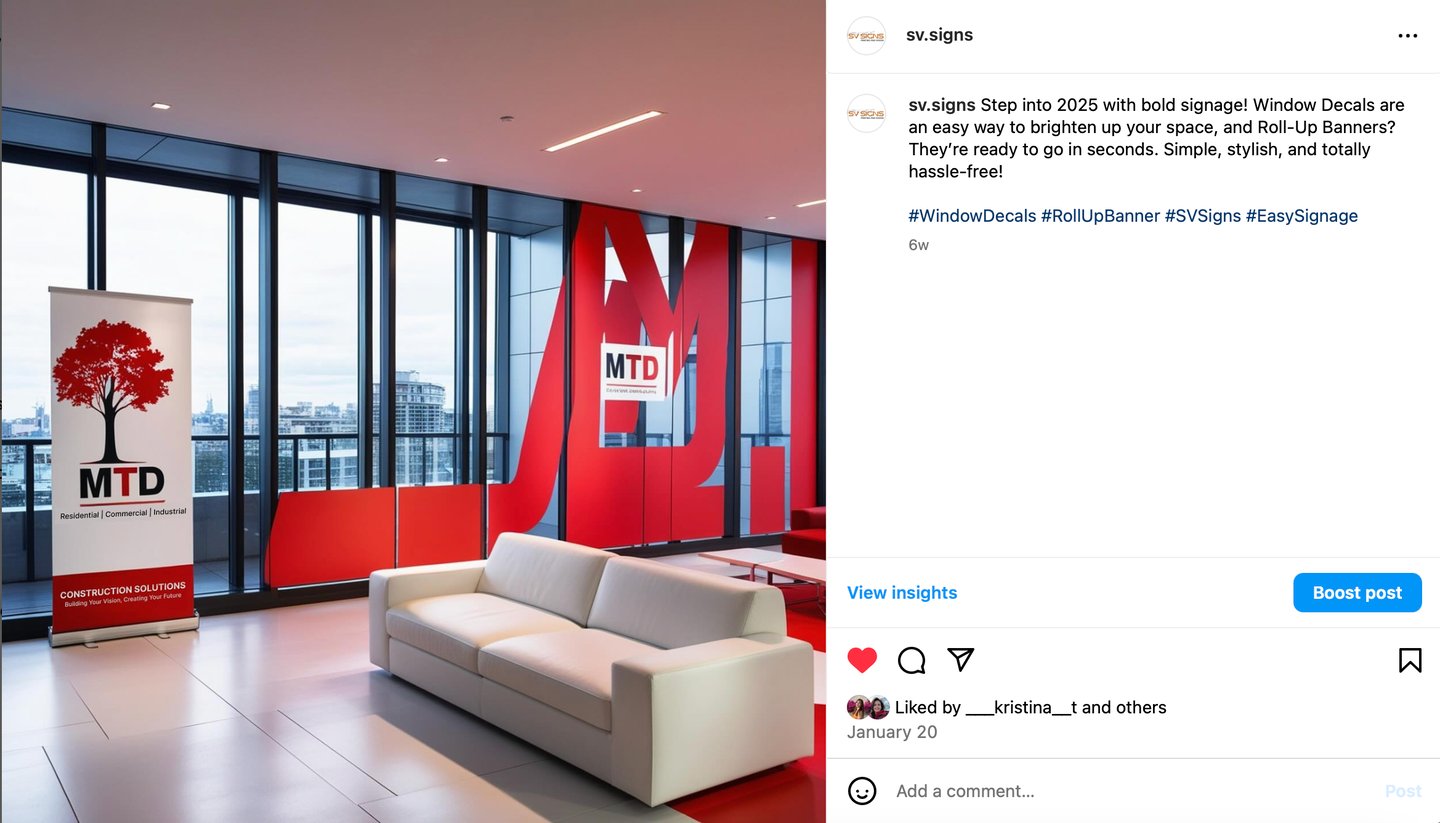
SV Signs had a limited digital presence, relying primarily on its website for customer acquisition.
To expand reach and engagement, I established and managed the brand’s presence on Instagram and Pinterest, turning social media into a powerful discovery and conversion tool. By analyzing customer interactions, it became clear that potential buyers weren’t just looking for signage—they sought inspiration, real-world applications, and proof of quality.
Social media content was designed to bridge that gap, showcasing signage in action with compelling visuals, clear messaging, and strategic hashtags. This approach transformed passive browsing into real engagement, driving traffic to the website and strengthening brand trust in a competitive market.