
Colborne Collective needed more than a website — they needed a brand. I built their identity from the ground up and designed a modern platform that communicates trust, clarity, and a distinctly Niagara character.
My role
Branding (logo, color system, visual identity)
Information architecture, prototyping & UI design
Web content adaptation
Production & delivery
Results
2× faster content updates with a simplified backend
Stronger brand recognition through a cohesive identity
Boosted visibility via clear structure and responsive design
Increased trust and engagement with transparent services and team profiles


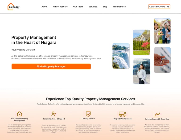
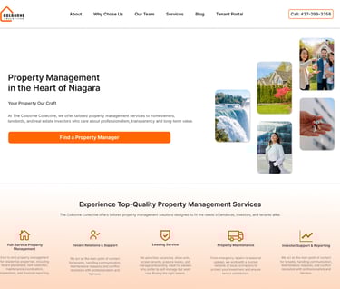
Colborne Collective entered Niagara’s property management space with a vision to stand apart from competitors that often felt too corporate or outdated.The challenge was to create a brand and website that balanced professionalism with a more human, community-focused touch — something modern, minimal, and trustworthy.
Starting with raw service descriptions, I developed the complete brand identity — from logo and color system to content structure and visual style — and translated it into responsive Figma prototypes.
The key was to create a brand that communicated transparency and trust, with a clear sense of place.

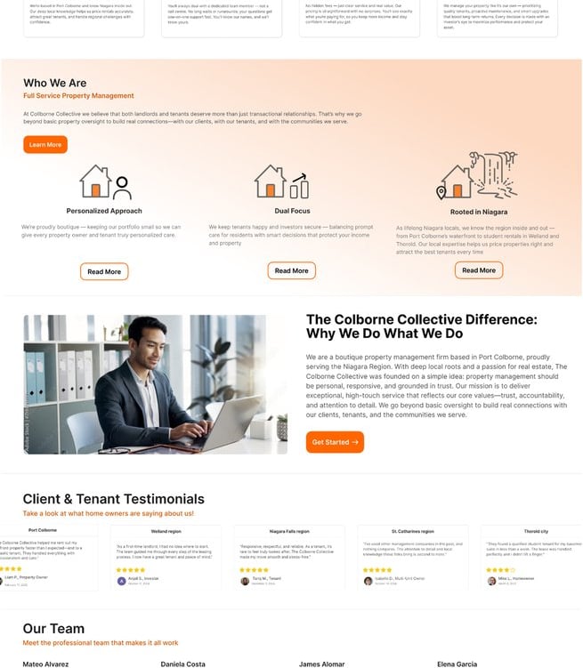
The brand needed to capture two sides: the reliability of a professional property manager and the warmth of a community-first business. I distilled these values into a simple design language that is clean, modern, and instantly recognizable.
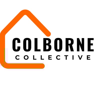

The logo uses a house outline - a universal symbol of property - refined into minimal, geometric form that signals clarity and trust.
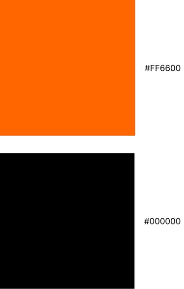
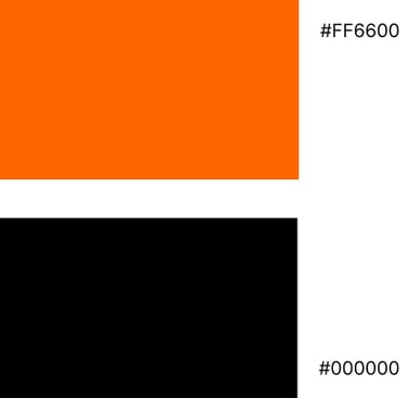
Strong typography anchors the identity with confidence, while the bright orange accent adds energy and visibility across both digital and print applications. To balance this, I paired the vibrant orange with a monochrome palette, combining approachability with authority.
The result is a brand system that feels modern and trustworthy, with a strong local character that stands out in Niagara’s property management landscape.
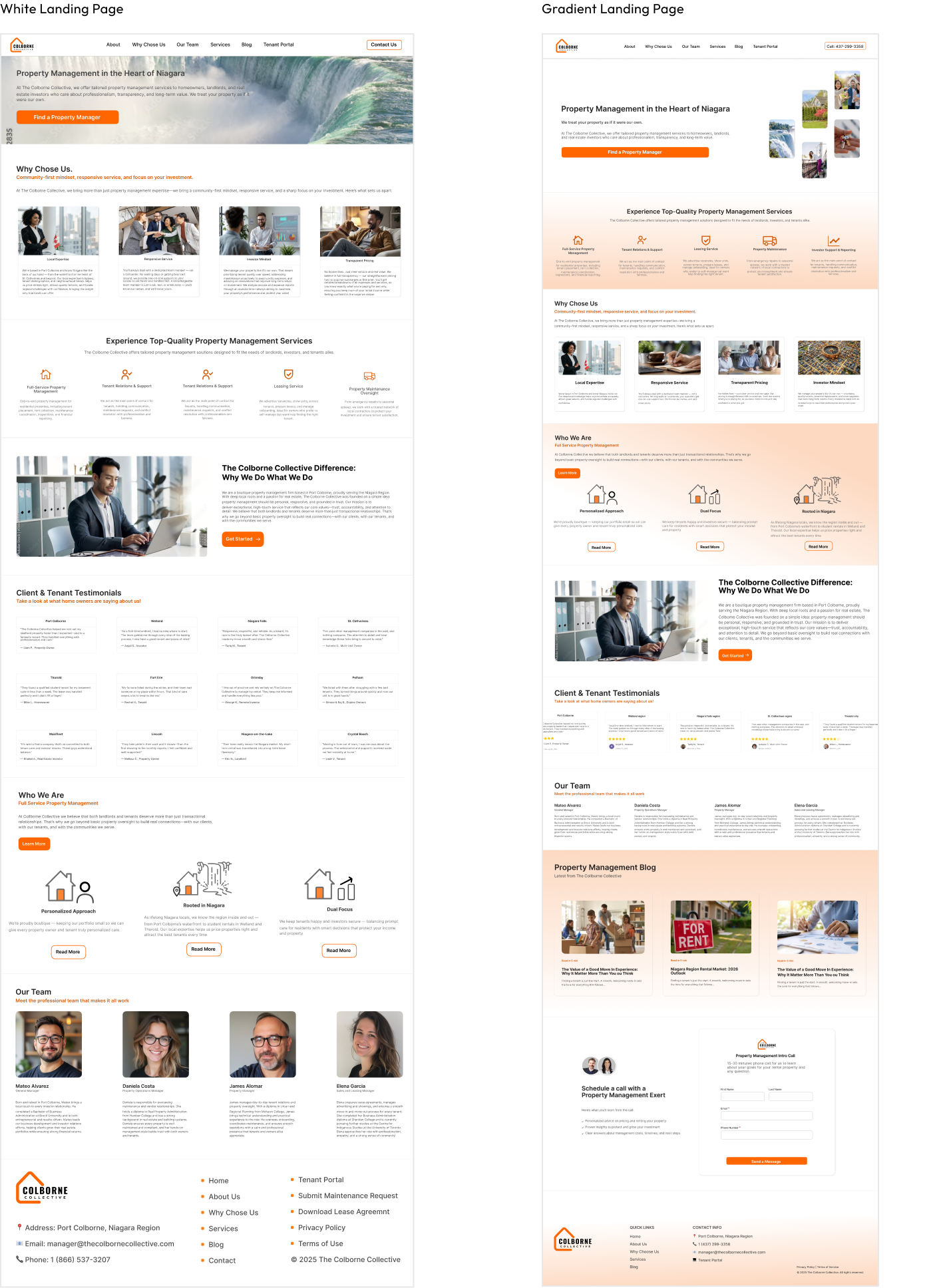
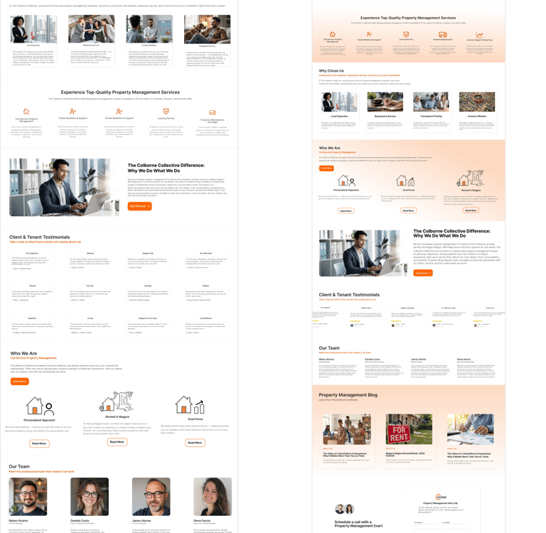
The biggest design decision was balancing minimalism with warmth - adding gradient depth and local imagery to avoid a cold, overly white look.
Like any identity project, the design went through iterations before reaching the final system. Early logo drafts experimented with different house outlines and typography weights before I refined the form into the minimal, geometric mark used today.
On the landing page, my first version relied on a clean white background, but it lacked hierarchy. Introducing soft gradients brought structure and contrast, while keeping the overall design modern. Similarly, replacing generic stock photography with authentic Niagara images gave the brand a stronger sense of place. These choices turned a simple layout into a design that feels both professional and connected to the local community.